
This week’s Journal assignment was to find ads with good synergy, where the images and text rely on one another.
I really like the U by Kotex ads for their strong and sometimes defiant voice, as well as their bold images. This U by Kotex ad is no exception. The image shows a female hand holding a clear purse that contains the regular keys, wallet comb, and sunglasses as well as a box of tampons. The items in the purse mimic the U by Kotex color pallet. And the bold text gives the ad a strong voice.

The second Kotex ad uses humor to mock the cliché of white bikinis in tampon ads while it displays a vintage style black and white photo of a young woman in a white bikini. The use of sans serif white text on a transparent blue background gives the copy a fresh, modern look against the dated look of the image.

These next two ads by Always are beautiful visual metaphors, explained by the copy. The images and the headlines are eye-catching and puzzling. They cannot be fully understood without reading the body copy. The first ad shows a peach in an F-clamp. The headline reads “Tender” in decreasing font sizes as if the text itself was being tightened in a clamp. I wish I could read the body text, but the resolution is too low.
The second Always ad shows a clear plastic purse filled with water and the headline reads “bloated old bag” with the o in bloated appearing bloated its self. The body copy talks about how much water can women retain on their period. It also tells them what they can do to retain less water. The cool blues used in this ad reinforce the idea of water.

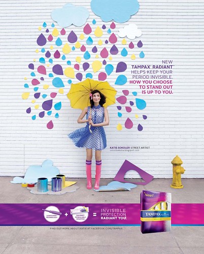
This last ad is from Tampax. It features artist Katie Sokoler and her work. The image shows a street art piece with Katie holding an umbrella under brightly colored paper raindrops. It is a bright and playful piece. The colors used in the street art installation follow the color palette of the Tampax Radiant brand. The ads copy links the image to the brand, “New Tampax Radiant helps keep your period invisible. How you choose to stand out is up to you.”

One thing that I think is interesting is that although the Tampax and the U by Kotex ad both use bright colors their messages are very different. Tampax offers to hide your period while U by Kotex says there is nothing to hide. When I was doing research for the DivaCup, I found a piece in Packaged Facts that talked about the demographics of tampon users versus pad users. It said that tampon users are generally younger and more uncomfortable with their period. They used tampons so they wouldn’t have to see it. So, I wonder which message was more effective.
What do you think?
References
Always (2001) Bloated old Bag. [image file] Retrieved April 21, 2015, from http://files2.coloribus.com/files/adsarchive/part_304/3041605/file/always-pantyliners-bloated-old-bag-small-97540.jpg
Always (2001) Tender. [image file] Retrieved April 21, 2015, from http://files1.coloribus.com/files/adsarchive/part_304/3041705/file/always-pantyliners-tender-small-45854.jpg
Kotex (nd.) Kotex Natural Balance (white bikini). [Image File] Retrieved April 21, 2015 from http://payload58.cargocollective.com/1/5/164429/3460785/miami_bw_6.jpg
Kotex (nd.) U by Kotex print ad. [Image file] Retrieved April 21, 2015, from http://menstruationresearch.org/wp-content/uploads/2012/10/U-by-Kotex-ad.jpg
Packaged Facts (2006, July) Feminine Hygiene Products in the U.S.. Retrieved from MarketrRsearch.com Academic database.
Tampax (2012) Tampax Radiant with Katie Sokoler. [Image file] Retrieved April 22, 2015, from http://farm9.staticflickr.com/8022/7212128648_3000e18d96.jpg
